The Equity Markets: The Tech Bubble, The Pandemic Bubble, & The Return of Value Investing
“I can calculate the motions of the heavenly bodies, but not the madness of people.”
Sir Isaac Newton
Comment on Losing Money in South Sea Bubble
Spring, 1720

For those who participated in the Equity Markets in 2020, owning a portfolio of the Top 5 largest securities would have produced outsized returns for the year, through October 31. These stocks disproportionately benefitted from the Pandemic, as they became the principal beneficiaries of the lockdowns and work from home requirements. While the S&P 500 rose only 9.2% through the end of October, these stocks exploded upward, Apple +48%, Microsoft +28%, Amazon +64%, Facebook +28%, and Google +21%, collectively rising 38%. As these companies grew and fast forwarded several years of growth into 2020, their spending to support their growth flowed through to numerous other companies across the technology arena. This drove the technology heavy NASDAQ up more than 21%. At the same time as these stocks benefitted, investors became enamored of all things growth. These companies, such as P&G or Clorox, could continue to grow despite the Pandemic, with the lockdowns accelerating their volume growth and pricing power as consumers shifted spending from eating out to eating in and into sanitary products. Thus, investment flowed into this area and out of areas tied to the general economy. Growth stocks, as exemplified by the Russell 1000 Growth, rose more than 19%, while Value stocks, as exemplified by the Russell 1000 Value, fell almost 15%. This 34%+ difference in performance represents the largest performance differential since the 1999 – 2000 Technology Bubble.
This extreme dichotomy in performance coupled with current valuations now puts the Growth Stocks at risk of an extended period of underperformance, similar to the outcome after The 1999 – 2000 Tech Bubble. The following Table illustrates this differential: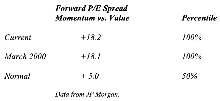
The peak of The Tech Bubble in 2000 stands as the last time this P/E Spread stood this wide. And if one were to look at the broader market a similar picture emerges:
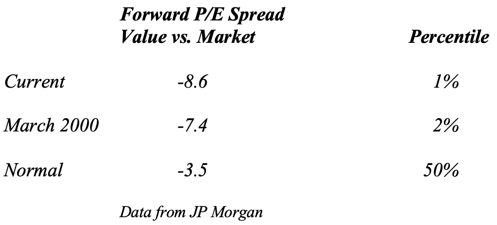
In fact, the P/E Spread between Value stocks and the Equity Market averages now exceeds the spread at the 2000 peak of The Tech Bubble, with the 1973 peak of the Nifty 50 the only historical episode with similar differences in valuation. This spread actually began to close in December 2019 and January 2020 before The Pandemic Hit, as the Global Inventory Cycle turned to a positive phase, which typically accelerates economically sensitive companies’ revenue, earnings, and cash flow. The Pandemic shut down the economy which, of course, short-circuited this natural transition in the economic cycle, bringing forward the Recession from what likely would have been a late 2022 start to early 2021. This drove the differentials in valuation between Growth/Momentum stocks and Value stocks, which already stood at statistically significant levels, to an extreme, only seen at the peaks in 2000, 1973, and 1929 over the past 100 years. With the recent data released by Pfizer on their vaccine, a vaccine that demonstrates 90%+ effective immunity against COVID-19, mean reversion may have already begun, as investors begin to anticipate a reopening of the economy next year.
Unfortunately, such peaks in valuation differentials typically coincide with extremes in valuation for the overall Equity Markets. Multiple indicators demonstrate the extreme in overall valuation that exists today. Robert Shiller’s CAPE Ratio, one of the oldest and most well known, continues to blink Red for long term investors:
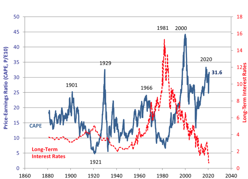
Chart courtesy of Robert Shiller, Yale University, http://www.econ.yale.edu/~shiller/data.htm .
As the graph indicates, valuation stands at similar levels to 1929. While this ratio is poor in predicting short term movements in the Equity Markets, it provides an excellent inverse correlation with 10 Year Returns. In other words, low readings portend high 10 Year Returns, while high readings, such as currently, produce low 10 Year Returns. A similar picture emerges from Tobin’s Q, which measures the public market value of equities against the replacement value of their assets:
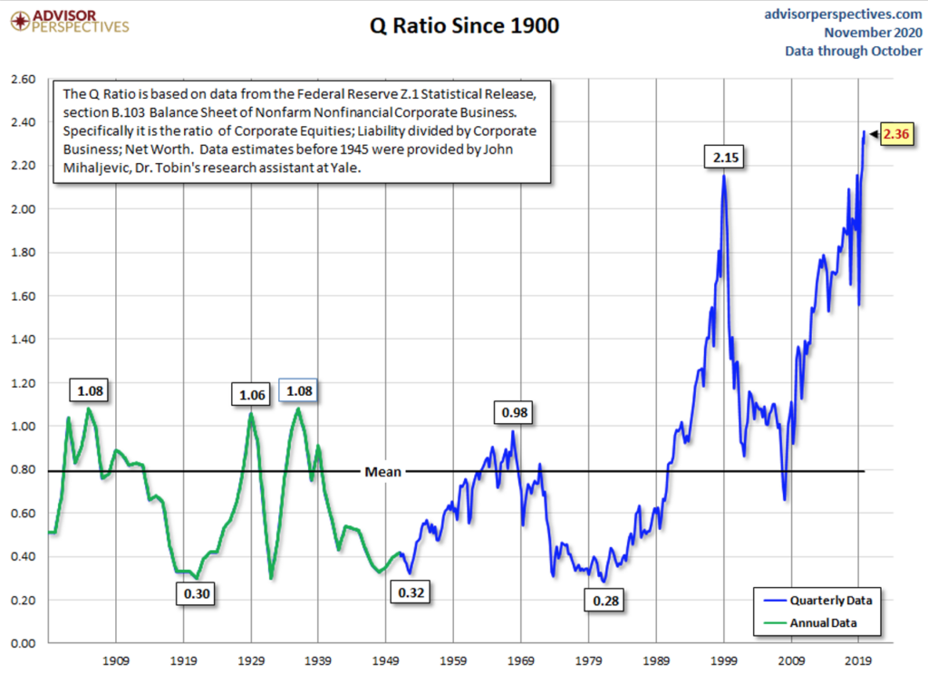
Chart courtesy of Advisor Perspectives, www.advisorperspectives.com .
And while US corporations deliberately decapitalized their balance sheets over the past decade, thus distorting this ratio somewhat, this drop in assets only accounts for a fraction of the rise in this ratio. That this ratio rings true gains confirmation from “The Buffett Indicator”, which measures the market capitalization of the Equity Markets compared to GDP:
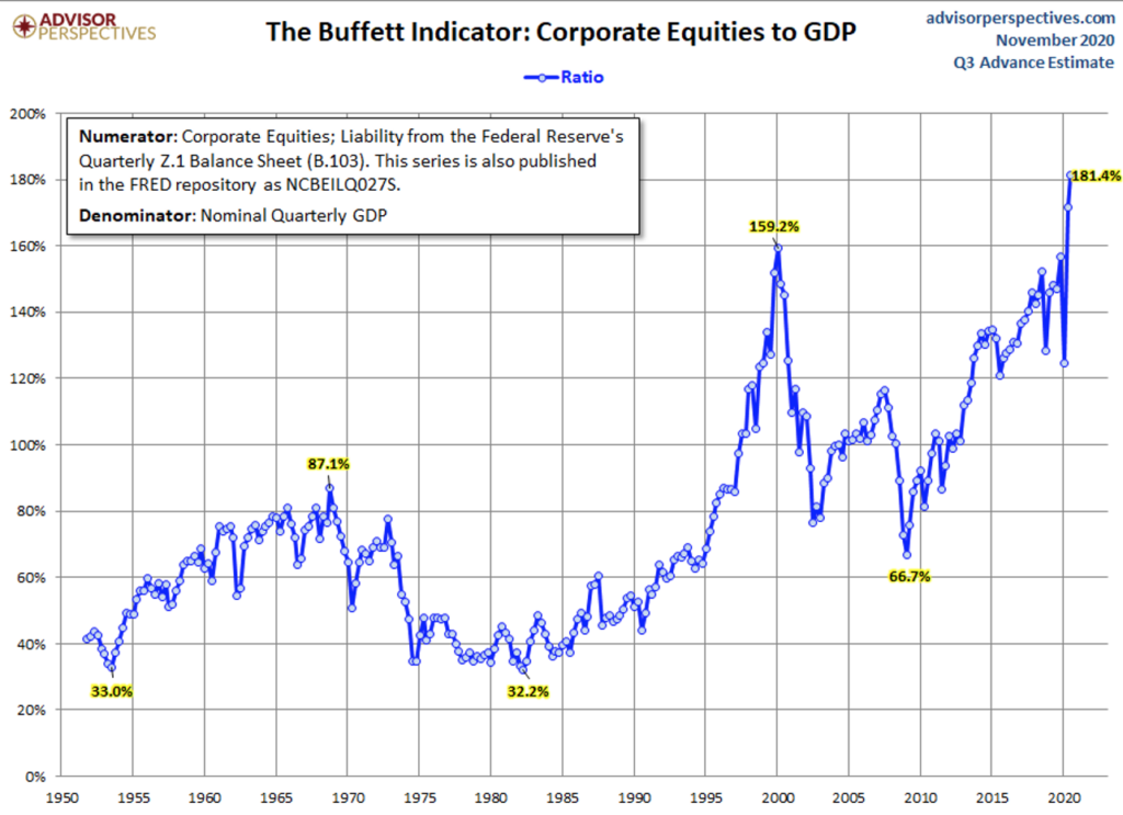
Chart courtesy of Advisor Perspectives, www.advisorperspectives.com .
This indicator now exceeds its 2000 Tech Bubble Peak by almost 14% (13.94% to be precise). This equates to 3.0+ standard deviations from the mean. And, if detrended for an assumed rise over time, as international sales have become a larger and larger portion of the Equity Markets’ revenues over the past 50 years, the current valuation still equates to over 2.5+ standard deviations from the detrended mean, a record only exceeded in 2000. All in all not a good prescription for long term capital appreciation. And if you flip these charts, they possess an uncanny correlation with 10 Year Forward Returns, which makes sense both intuitively and from an analytic perspective, as the following chart demonstrates:
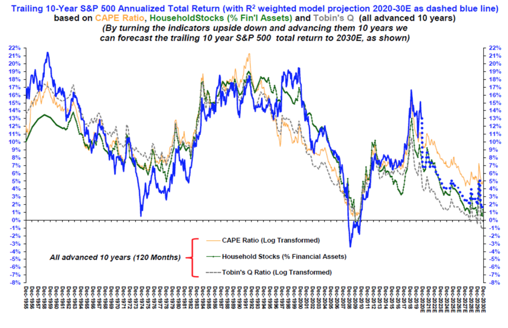
Chart courtesy of Stifel Nicolaus, LLC, www.stifel.com .
And while the market can deviate over a short period of time, the long term results are clear. Thus, like the 10 Years following The Tech Bubble, the coming decade following The Pandemic Bubble will likely prove disappointing to equity investors.
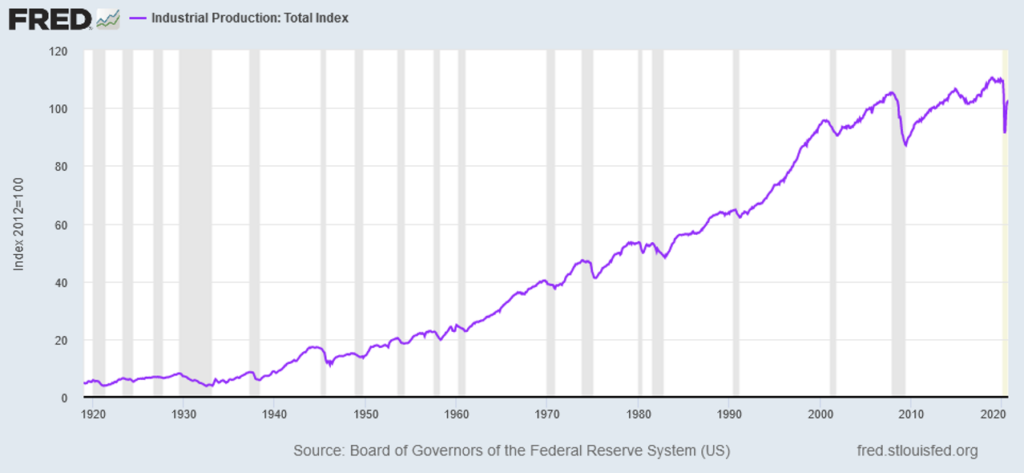
For investors, with a vaccine in hand, near term salvation may come in the form of “Regression to the Mean”. In other words, investing with the belief that markets return to statistical means as long term economic cycles ultimately dominate investment returns. Two long term cycles standout, in this perspective. One relates to the coming economic recovery, as economic growth broadens out to include the overall economy. The other relates to the resolution of the government debt cycle and commodities. As indicated above, the Growth/Momentum stocks stand at a statistical extreme relative to Value stocks. They disproportionately benefitted from the shutdowns imposed by governments. At the same time, numerous companies tied to the real economy suffered from these government imposed edicts. As governments move to reopen their economies as the vaccines rollout, those companies tied to the real economy should benefit. The following chart of Industrial Production shows a sharp rebound underway:
And when viewed on a Year-Over-Year basis, it becomes clear that sharp upswings typically follow sharp downswings historically:
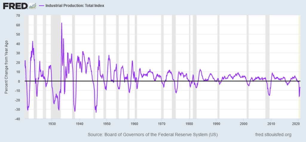
Given this history, a broad recovery in the economy should produce accelerating fundamentals for those companies impacted by the economic shutdowns, which principally mean Value stocks.
The other cycles to watch include the long term government debt cycle and the long term commodity cycle. As most people know, Federal Debt to GDP soared in the US over the past year and the past decade:
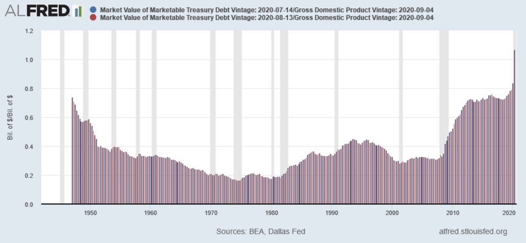
At this level, it now equals the peaks seen in World War II, having added 10%+ to this ratio to fight The Pandemic’s economic impact:
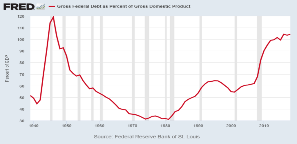
As the second chart only goes to 2019, adding the change over the last year would bring the level to its 1942 peak.
When Government Debt reaches such peaks, governments usually inflate their way out of debt problems. For the United States, there occurred significant bouts of inflation from 1776 – 1785, 1810 – 1814, 1861 – 1865, 1911 – 1920, 1939 – 1952, 1956 – 1959, 1966 – 1982, and 1987 – 1991, according to the Federal Reserve. (Please see https://www.minneapolisfed.org/about-us/monetary-policy/inflation-calculator/consumer-price-index-1800- for data from the Federal Reserve of Minneapolis.) Many would argue that the period from 2003 – 2008 also saw significant inflation as commodity prices tripled, healthcare prices compounded at high single digits, consumer goods prices rose rapidly, and housing prices more than doubled. As these examples demonstrate, the US possesses a long history of utilizing inflation to repay debt in depreciated dollars to avoid the economic consequences of borrowing too much.
Typically, such periods of inflation coincide with periods when commodities outperform equities in real terms. In addition, equities can provide negative real returns at those times. For example, from 1966 – 1980, prices soared but equities went sideways. A similar experience occurred more recently from 2000 – 2008. Furthermore, when Equity outperformance of commodities reaches extremes, a reversion to the mean can occur. This originates in the fundamental economic relationships that exist between various asset classes, that creates a self-correcting mechanism. With commodity cycles long, most individuals stand unaware of their cycle and fundamental impact on investing. The following chart provides a long term perspective on this:
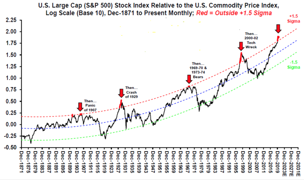
Chart courtesy of Stifel Nicolaus, www.stifel.com .
As the chart demonstrates, while stocks outperform commodities over the long term, there exist significant interruptions in which commodities outperform stocks. And with stocks having enjoyed a decade long period of outperformance, similar to what occurred in the 1920’s, reversion to the mean seems a reasonable outcome over the next decade.
For investors, the landscape looks eerily similar to 2000, with technology leading the charge and valuations at or above The Tech Bubble levels. However, unlike 2000, the economy stands in an early cycle position as opposed to late cycle, with traditional economy dependent Equities trading at recession like valuations. As the real economy begins to recover in 2021 and it becomes possible for citizens to resume their normal lives, these companies should benefit as spending directed to The Pandemic Bubble companies becomes redirected into other spending categories for both consumers and corporations. With these real economy companies disproportionately represented in Value Equities, investors should witness a reversion to the mean between Growth/Momentum stocks and Value stocks performance. And with stocks outperforming commodities massively this decade, a reversion to the mean in this relationship stands a distinct possibility as well. And with these commodity companies sitting in Value Indices, this should reinforce the fundamental attractiveness of Value Equities and Value Indices. Based on the playbook that worked during the periods from 1970 – 1980 and from 2000 – 2013, it appears The Equity Markets sit on the precipice with The Return of Value Investing ahead. (Data from The Federal Reserve, Eurostat, Statista, Stifel Nicolaus, JP Morgan, TradingEconomics.com, Robert Shiller of Yale University, AdvisorPerspectives.com, Bureau of Economic Statistics, OECD, U.S. President, U.S. Congress, and numerous other US government agencies coupled with Green Drake Advisors analysis.)
Confidential – Do not copy or distribute. The information herein is being provided in confidence and may not be reproduced or further disseminated without Green Drake Advisors, LLC’s express written permission. This document is for informational purposes only and does not constitute an offer to sell or solicitation of an offer to buy securities or investment services. The information presented above is presented in summary form and is therefore subject to numerous qualifications and further explanation. More complete information regarding the investment products and services described herein may be found in the firm’s Form ADV or by contacting Green Drake Advisors, LLC directly. The information contained in this document is the most recent available to Green Drake Advisors, LLC. However, all of the information herein is subject to change without notice. ©2020 by Green Drake Advisors, LLC. All Rights Reserved. This document is the property of Green Drake Advisors, LLC and may not be disclosed, distributed, or reproduced without the express written permission of Green Drake Advisors, LLC.