Equity Markets: Those 1960’s Again

“There was, however, a radical fallacy involved in the new-era application of this historical fact. This should be apparent from even a superficial examination of the data contained in the small and rather sketchy volume from which the new-era theory may be said to have sprung. The book is entitled Common Stocks as Long-Term Investments by Edgar Lawrence Smith, published in 1924. Common stocks were shown to have a tendency to increase in value with the years, for the simple reason that they earned more than they paid out in dividends, and thus the reinvested earnings added to their worth…
The attractiveness of common stocks for the long pull thus lay essentially in the fact that they earned more than the bond-interest rate upon their cost. This would be true, typically, of a stock earning $10 and selling at 100. But as soon as the price was advanced to a much higher price in relation to earnings, this advantage disappeared, and with it disappeared the entire theoretical basis for investment purchases of common stocks. When investors paid $200 per share for a stock earning $10, they were buying an earning power no greater than the bond-interest rate, without the extra protection afforded by a prior claim. Hence, in using the past performances of common stocks as the reason for paying prices 20 to 40 times their earnings, the new-ear exponents were starting with a sound premise and twisting it into a woefully unsound conclusion.”
Chapter XXVII: The Theory of Common Stock Investment
Part IV: Theory of Common Stock Investment. The Dividend Factor
Security Analysis, 1934
By Benjamin Graham and David Dodd
For those unfamiliar with stock market history, the recent market movements appear to resemble more and more the second half of the 1960s. This is due to the economic growth and actions of the Federal Reserve. In September, 1961, the Federal Reserve began to gradually raise interest rates. This continued until 1966. At that point, the Federal Reserve began to worry about inflation. So, it pre-emptively tightened in 1966 to prevent a surge in inflation. By the time it finished in October, 1966, the Federal Reserve succeeded in slowing economic growth dramatically, from 8% to less than 4%. The stock market swooned. Then, in response to the slowdown, the Federal Reserve lowered rates from 5.76% to 3.90% in August of 1967. The market took off, making a new high in 1967. The economy responded, with a lag, reaccelerating in the second half of 1967. As the economy began to reaccelerate, the Federal Reserve began to raise rates once more in late 1967. They paused briefly from April to November 1968 due to the Presidential election. They then raised rates rapidly from January 1969 to their peak in October 1969. The market continued upward until November 1968. It then began, what came to be known, as the 1968 – 1970 Bear Market, which brought the S&P 500 back to the lows seen in late 1966.
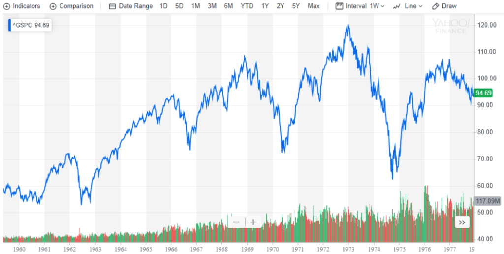
Chart courtesy of Yahoo Finance (https://finance.yahoo.com/ )
A similar tale appears to be unfolding today. With the end of Quantitative Easing in 2014 and the beginning of Quantitative Tightening, the Fed effectively raised rates, even though the stated rate stayed at 0.0%, as the chart below demonstrates:
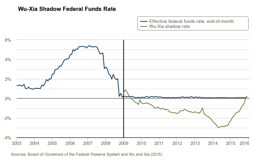
It is unclear whether the real Fed Funds Rate actually reached an effective rate of -3.0%. Based on other data, a reasonable rate of -1.50% appears to have been achieved, which was gradually raised to 0.0% by late 2015. The Federal Reserve then began to raise actual rates steadily beginning in 2016, driving the Effective Fed Funds Rate to 2.40%. Increases of 3.0% or more in rates by the Federal Reserve historically lead to corrections or bear markets in the Equity Markets. The drop of 21% in 2018 exactly matched the drop in 1966. With the Federal Reserve realizing its mistake in January 2019 and Central Banks around the world easing, the Equity Markets rebounded, moving to new highs, as in 1967. With more Federal Reserve rate decreases ahead, to prevent an inversion of the 2 Year – 10 Year Yield Curve and prevent a recession, markets will likely grind higher over time, much as in 1967 – 1968. (Please Note: Should the Fed allow the Yield Curve to invert significantly and refuse to ease, then an alternative scenario called a Bear Market would ensue followed by a Recession. With a Presidential Election in 2020, the Federal Reserve will likely move to preserve its independence.) The following chart shows market movements over the past 5 years:
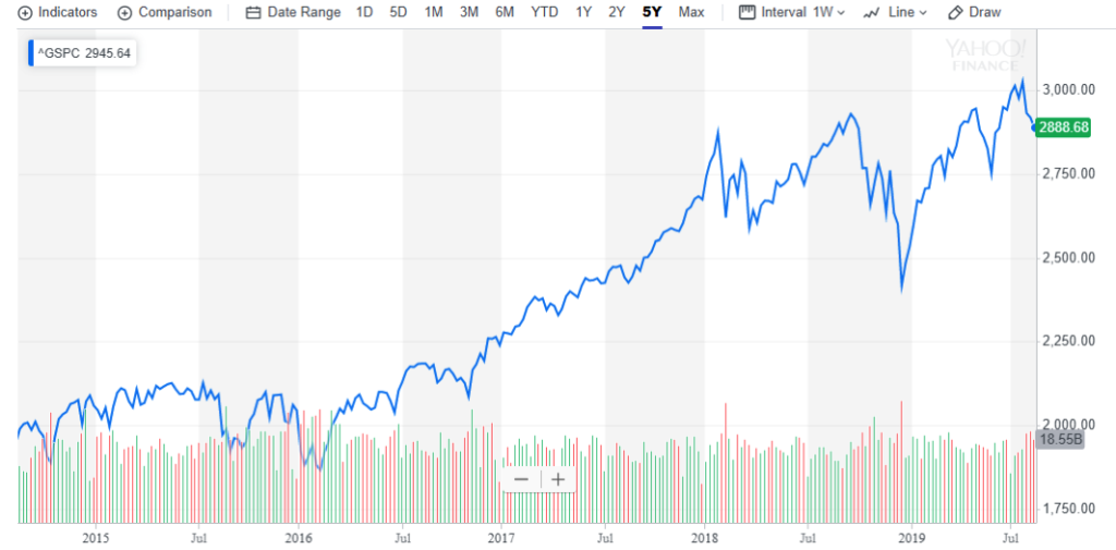
Chart courtesy of Yahoo Finance (https://finance.yahoo.com/ )
As is clear from the chart, the market movements in 2019 look eerily similar to 1967. Should the Federal Reserve follow the script from that era, which looks more and more likely, then tightening would resume in late 2020 or early 2021, leading to a late 2021 or 2022 recession.
Stocks continue to exhibit valuations reminiscent of this period as well. As the following CAPE Chart from Robert Shiller makes clear, valuations continue at historically high levels:
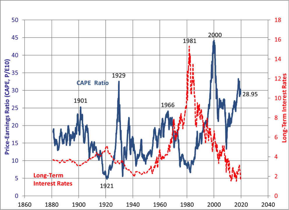
Chart courtesy of Robert Shiller available at http://www.econ.yale.edu/~shiller/data.htm .
This reflects the benefits of the WTO, leading to very high levels of corporate profits to GDP, coupled with the massive cut in corporate tax rates.
Unfortunately, it appears that the benefits of the WTO to corporations will come under increasing pressure as workers demand a greater piece of the economic pie and a new Cold War heats up between China and the US. This can already be seen in Corporate Profits:
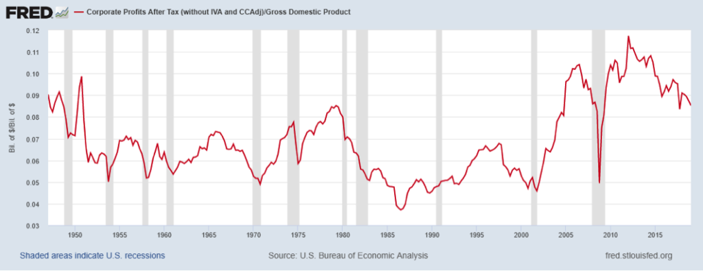
As the chart makes clear, corporate profits to GDP effectively hit a plateau from 2006 – 2014, with a dip for the recession. Since then, corporations’ profits steadily lost share of U.S. GDP. (Note: This coincides with the slowdown in Global Trade growth.) With continued pressure on China, the WTO and the location of plants overseas, this trend likely will not reverse anytime soon. In fact, it likely will return to its 1950 – 1980 range as corporations must spend more on plant and equipment, increasing Depreciation as a percent of revenues. And, as the Shiller CAPE Chart above makes abundantly clear, any time the CAPE reached a peak and began a mean reversion in the past, it subsequently fell by more than 50%.
The other piece of “Good News” for the Equity Markets, concerns the drop in the Equity Risk Premium (ERP). The ERP began to drop in the late 1950s reflecting the rise of Western economies as the dominant economic power. Excluding the inflationary late 1970s, the ERP continued to drop into the l980s, as Ronald Reagan become President and the Western World won the Cold War with Russia. Starting in 2001, the ERP began to rise again, reflecting China’s rise as an economic power and the new challenge to U.S. hegemony. The following chart demonstrates this sequence of events:
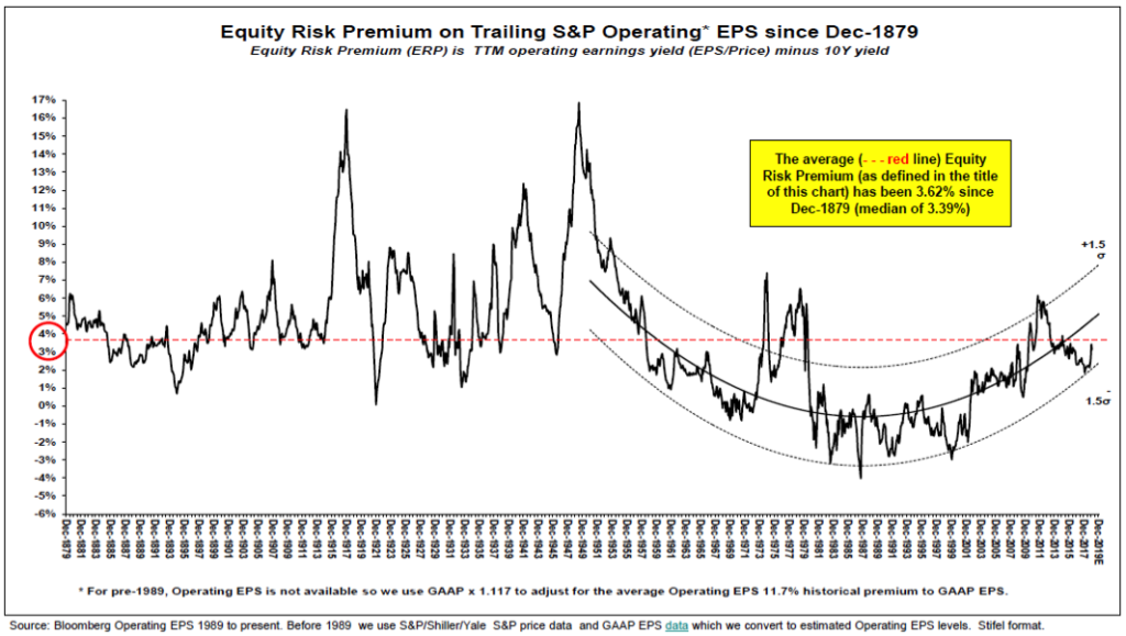
Chart courtesy of Stifel Nicolaus & Company.
With the ERP headed upward, a return to earlier levels would represent a major challenge to today’s P/Es. And would reinforce the reversion to the mean ahead for P/Es indicated by the Shiller CAPE Chart above.
For the Equity Markets, it feels like 1967. There are further heights to be scaled ahead. But a true Bear Market lies just beyond. And then, should policies like Modern Monetary Theory come into fashion, likely in the 2020s, resembling policies followed during the 1940s in a war economy, true inflation like the 1970s could once more come to dominate. But, in the meantime, as the markets retrace their history from 1965 to 1970, it is Those 1960s Again. (Data from Yahoo Finance, Robert Shiller and Yale University, and public sources coupled with Green Drake Advisors analysis.)
Confidential – Do not copy or distribute. The information herein is being provided in confidence and may not be reproduced or further disseminated without Green Drake Advisors, LLC’s express written permission. This document is for informational purposes only and does not constitute an offer to sell or solicitation of an offer to buy securities or investment services. The information presented above is presented in summary form and is therefore subject to numerous qualifications and further explanation. More complete information regarding the investment products and services described herein may be found in the firm’s Form ADV or by contacting Green Drake Advisors, LLC directly. The information contained in this document is the most recent available to Green Drake Advisors, LLC. However, all of the information herein is subject to change without notice. ©2019 by Green Drake Advisors, LLC. All Rights Reserved. This document is the property of Green Drake Advisors, LLC and may not be disclosed, distributed, or reproduced without the express written permission of Green Drake Advisors, LLC.